Wednesday, 28 December 2011

The making of my digipak!

After completing my magazine advert, I knew that I had to include images of Lauren in the lace dress on my digipak in order to obtain continuity. I already knew that I wanted to use the same image that I had used for my magazine advert inside my digipak. After researching digipak's see here I decided that I wanted to re-create a design similar to Rhianna's for her album 'Loud'. It was a 6 panel digipak for 2 CD's, as my own design would be constructed for just 1 CD, I wanted to place the CD in the centre panel.


I found a template online which I thought would be suitable for my design. I opened the template into Photoshop and began editing! I started with the album cover. 
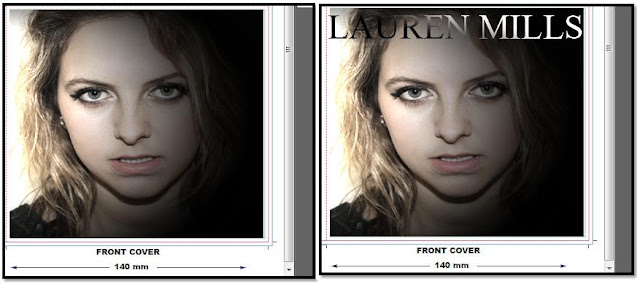
When researching album covers see here I found that the majority of female R&B artists had a close up, head shot image of themselves with the artist/album name clearly and boldly stated. I wanted to create something similar and chose an image which I thought successfully showed authenticity, and made sure that Lauren was wearing the same outfit as she was in the magazine advert as planned. I used the 'spotlight tool' in order to create a more interesting effect, rather than simply having the image plodded on the front cover and I had found that a lot of the album covers I had come across whilst researching were quite dark and contrasted. I then added the Self Titled album name, using the same font as the magazine advert for continuity, but used the 'Gradient tool' on the text to make it more visible in lighter/darker areas of the picture as well as for a more interesting effect. 
I then Started to add the image that I had used for my magazine advertisement onto the three inside panels. This was a really tricky step, as I found it really difficult to line up the images in each box, as my template had separate boxes for each panel I thought it would be quite effective to separate the image rather than linking the panels together! Eventually I managed to fit the image into the three boxes, I particularly liked the effect of the heels against the wall, which meant there wasn't much room for the artists head to be in frame, but I feel that this is actually quite effective!
I then reduced the opacity of the image in the centre layer, and began to erase in appropriate areas, this meant that the template for the CD disk could be visible! 
I then started to edit the back cover, I chose  to use a long, full shot of Lauren (again in the lace dress) and placed it to the right hand side of the panel, leaving space for the track numbers. I made the panel a neutral colour, similar to the rest of the panels to keep up the continuity of the overall design. 


I then made up some track names which were similar to other R&B artists songs following the diva attitude, and heartbreak theme of the track that I am using for my music video. I chose to list 14 plus a bonus track in total, as I found this to be popular for female R&B artists, such a Rhianna with her album 'Loud.'  I used the font 'Calibri' which is very simple, avoiding business, as the back cover will need to hold a lot of text!
I also took the bar code image from this particular album cover and added it to the back cover panel of my digipak. 
I then Made up some small print text to add to my digipak. Album covers include text displaying who the album is produced, distributed and manufactured by etc. I researched and copied from my own CDs adding information which was relevant to the record label I had chosen previously see here I added this detail to make my digipak as accurate as I could. 
My small print text: 

www.laurenmillsofficial.co.uk       srpmusicgroup.com
℗2011 *Produced by Carl Sturken and Evan Rodgers ∙ *Marketed by SRP music group ∙ * The copyright in this sound recording is owned by SRP music group ∙ *This label copy information is the subject of copyright protection ∙ * All rights reserved ∙ ©2011 SRP music group ∙ * Published by SRP music group ∙ * Printed in the EU ∙ 7243 5 40504 2 8 ∙ UK ∙ 540 5042 ∙ F:PM 520 ∙ * Place of manufacture EU ∙ * Marketed and Distributed by SRP music group ∙


I also added the logo for my chosen record label to make my digipak as authentic as possible. 

My final step was to edit the left cover. The left cover Of Rhianna's digipak which I have been following for inspiration displays a close up image of the artist wearing the same costume, hair and make up style as she is on the front cover. I decided to look through the images that I had taken of Lauren during the photo shoot of her wearing the lace dress, and see if there was an appropriate image for this particular panel. I wanted to include either a close-up image or mid-shot in order to obtain the accuracy of the overall design! 
I found an image of Lauren sat on the stool which is featured in the image of her lying down, This is a full shot of Lauren, But this seemed to be the most effective design, rather than another close up. I increased the contrast levels, and decreased the saturation levels in order to make the image blend in with the rest of the design. 


I am really pleased with the overall design of my digipak and feel that it is very authentic to the R&B genre and accurately shows the appropriate style of a digipak, including all of the relevant information. It also links well with my magazine advert which helps to promote brand recognition!


Re-doing my magazine advert!

As I have made a lot of changes to my coursework, changing the actress and costumes etc. (plus I was unhappy with my previous attempt) I needed to make a new magazine advert, in order for my ancillary tasks and music video to have continuity! My last magazine advert see here made the artist look 'rocker-chick' rather than 'R&B' which is the style that I aiming for, therefore during my latest photo shoot I took into consideration what hair, make-up and outfit style would be most authentic for the genre I am concentrating on.
I also want the artist to be wearing the same outfit on both the magazine advert image and the images included on the digipak, to ensure brand recognition. Therefore I needed to find the most effective images for both tasks with the actress in the same costume and hair/make up style etc. 
I was really pleased with the outcome of the images taken of Lauren in the lace dress. I feel that the costume is really authentic and I want to include it throughout the music video. I particularly like the following image, and plan to use it on the inside of the digipak. I used tools such as 'the curves tool' to edit this photo and also increased the contrast levels to achieve this effect. 


To obtain continuity I really want to use this image for my magazine advert, this will mean having a landscape design rather than portrait, but I feel that this will be more eye-catching and make the advert more recognisable! I planned for this image to be the majority of the advert, and add relevant text in the spaces around the artist! 
I started by adding the artist's name, as the album is self titled I used this text for both the artists name and album name. I chose a simple font 'Mongolian Baiti' as during my previous attempt I found choosing a font very difficult, and the more fancy fonts made the overall design look a bit tacky. 


As the album is self titled, I needed to successfully show what the the advert was promoting. I therefore decided to add some information on the track that I am using for my music video (using the same font) which helps to show that it is an album being advertised. 


Carrying on with this, I also added a release date for the album, showing where it is available, I chose a green bold font which I felt linked with the dress. I chose iTunes as the provider as I found this to be popular for other R&B artists (e.g. Rhianna) I particularly liked how on this advertisement for Rhianna's album 'Talk that talk' there is an image of the album cover. However when I tried to re-create this on my own advert, It just looked too much and over-crowded, which spoilt the simplistic look. 


(my attempt at the small album cover image) 
I was really pleased with the font that I had used when adding a website address to my previous advertisement, therefore I decided to use the same font for my latest design and simply change the name from Alice Clark, to Lauren Mills. I think that this works really well, and differs from the simple font I have used elsewhere, without looking too much. I also lowered the opacity levels to help the text blend in subtly to the background image.  


I am really pleased with the overall design, I feel that it successfully shows the R&B genre and is much less busy than my previous design. It promotes the track which appears in my music video, and the costume will be included in both my second ancillary task (the digipak) and the music video which will help provide continuity throughout my coursework!


Sunday, 18 December 2011

Inspirational music video

Right at the beginning of my research and planning I produced a survey asking my fellow classmates and friends "What do you see when you watch and R&B music video, performed by a female artist?" (see here) and the most popular answer was "objectification." 
I feel that I have been concentrating so much on location and the relationship between the lyrics and the visuals (e.g. the diva attitude- female rejecting the male) that I have neglected the idea of objectification, which is very popular in R&B music videos.
In order to achieve the most accurate result, it is crucial that I include this element. Another point raised during this particular survey was "dance routines" as of yet, I have not planned to include a choreographed dance routine, however I feel that if I did, I could kill two birds with one stone, and present objectification during a routine.
I have started to look into R&B music videos which incorporate a choreographed dance routine (which is the majority of them) and feel that this particular video by R&B/Pop artist Brittany Spears- "Baby one more time" fits well with the results to my survey.
Throughout the video there are scenes of Brittany wearing a crop top and tracksuit bottoms whilst repetitively dancing to a choreographed routine. The crop top emphasizes her midriff area, and I feel that including a similar costume throughout my music video would make it really authentic to the genre. My plan is to choreograph a similar routine, and have Lauren dance whilst sporting a costume comparable to Brittany's in this music video!

Thursday, 8 December 2011

Ancillary task Shoot!

Today I took photo's for my new digipak and magazine advert. I printed out a variety of examples of R&B artists album covers so that I could have a clear idea of how to take the shots, and the makeup and hair styles which would be most appropriate in order to achieve the 'R&B look.' 


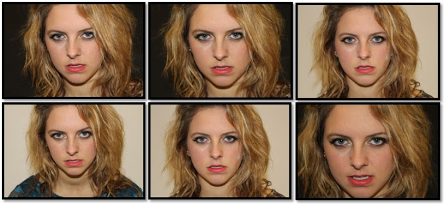
The artists in these examples tended to have quite dramatic makeup, with neutral colours. I tried my best to achieve a similar look and I am rather pleased with the overall outcome! The hairstyles in the album covers that I took a particular liking to were quite curly and voluminous. Lauren already has quite curly hair with a lot of volume! So I didn't have to style it that much. I took a lot of head-on extreme close up shots of Lauren, aiming to achieve a similar style the examples I had found. I took shots on both a white and black background, as the backgrounds varied on the examples, and I wasn't sure which would be most effective. I wanted to have a lot of images to choose from when it came to putting my digipak together!  


The two examples I followed!


A few of my own shots!


I then went onto taking various different shots for my magazine advert. I decided to take shots with Lauren wearing all of the different dresses, as during my last edit, I was unhappy with the outcome as the outfit didn't fit the R&B genre, and I didn't want to find myself in this situation again! I took a lot of shots so I would have many to test when it came to editing! I took many medium shots of Lauren's whole body, as I found this really effective previously! 

A few magazine advert shots!


I also took a couple more shots in positions which I had found to be successful from my previous shoot. I decided to photograph these with Lauren in the lace dress as this is a style that I have found to be currently popular for female R&B artists, and successfully fits the genre of my track. (see costume research post) I thought that these could be incorporated into my digipak!

Digipak photos


I attempted to shoot some footage today, but everything that could possibly go wrong, went wrong. Firstly, the (only) plug socket in the photography studio has blown, and therefore none of the lights could be plugged in (hence the photos being slightly-less high quality than my previous photo shoots, but this can be manipulated on photoshop.) After taking all of my photos I decided that I would try filming, although the lights weren't in use, as it was better than having nothing! However when I started to play my track, the wrong song had been downloaded! I ran out of time, and therefore myself and Lauren have decided to film tomorrow (Friday 9th) during my double media lesson and her free periods! I have decided to use a long extension lead (plugged in from another classroom) so I will be able to use the studio lights!

Wednesday, 7 December 2011

Planning for my NEW magazine advert

I have found it challenging to find R&B albums advertised in magazines, therefore I have chosen to stick closely to the design of my digipak. This will ensure both continuity and brand recognition. 
After being inspired by Rihanna's digipak to her album "Loud" I have decided that I want to include an image of Lauren lying across the three inside panels.


I have recently been researching, aiming to find some inspirational images of R&B artists posing in this position, and it has turned out to be quite popular for this genre! 


Beyonce:

Rihanna:

 Shontelle:

I particularly like how in the images of Beyonce and Rihanna, the heeled shoes have become an additional focus point. I am eager to recreate something similar for the inside panels of my digipak, and I feel that using the same image on my magazine advert could be really effective! These images seem to be landscape rather than portrait, which is something that I might consider when it comes to editing my advertisement, as this could make it more eye catching and memorable! 
My next step is to carry out a photo shoot, and I aim to capture some shots similar to the ones above. This will make my magazine advert accurate and authentic to the R&B genre as this lying down pose appears to be quite common.    

Costume changes!

As the actress that I was originally using for my music video has changed, I have also needed to change the costumes that I had planned to incorporate. Since my previous costume post, I have discovered that the majority of the music videos, which are studio based, tend to include the artist wearing a variety of different dresses. Myself and Lauren have collaborated our 'dress collections' together and picked out which ones fit the R&B genre. After doing more research, I found that the following three colours/prints/styles were the most popular for female R&B artists!  


Animal Print

The animal print style appears to be very popular, particularly for the R&B artists I have been focusing on during my research and planning! Luckily, I have an animal print dress which I Lauren can wear throughout the video. And she also owns a pair of animal print high heels! 

Lace

During my previous costume research, I found lace to be a very popular choice. However the black lace made the actress look more 'Rocker-Chick' rather than R&B. I have a more colorful lace dress which I feel will help to incorporate the appropriate style, whilst also presenting the correct genre!  

Sequins

Sequin dresses are really popular for female R&B artists! I plan to also incorporate this style into my music video in order to contribute towards presenting the correct elements of an R&B music video! 

Shoes

Female R&B artists tend to wear rather extravagant high heels when performing in their music videos. Myself and Lauren both own a couple of particularly high heels, which will achieve a similar look to the artists that I have been focusing on! 

Changes to my music video!

Due to unforseen curcumstances I have had to make some drastic changes to my music video in order to meet the upcoming deadlines!
The female artist from my music video will now be performed by 'Lauren Mills.' Although this will mean altering and changing a lot of detail for my ancillary tasks, I haven't been very happy with the current designs that I have produced, and have a lot of ideas to improve the overall authenticity of my two products. Looking back at the album covers I came across whilst researching female R&B artists, I have noticed that they include an extreme close up, head on, shot of the artist. I was unsuccessful when trying to re-create something similar during my previous photo shoot, so I am aiming to achieve this during my filming session tomorrow.  

I will also want to have a long shot of the actress for my magazine advertisment, as recently whilst editing I have found this to be really effective. I want to recreate something similar to the album cover by Jennifer Hudson, where she is looking away from her name.


As the actress has changed, I will now be using the name 'Lauren Mills' instead. I intend to find a really effective font for the title of the actresses name (as her album will be self titled) I really like the simple white fonts that are featured on both Leona Lewis's and Kelly Rowland's album covers. If I could find a similar font I feel that I could make my ancillary tasks really authentic, and fit the style of my genre!

Latest Filming Ideas!

I have gone against filming a 'bedroom scene' as I feel that this will ruin the continuity of my footage, but I have come up with some new ideas to assist the continuity. After coming across Ashanti's music video- 'The Way That I Love You.' I have really likened to the idea of the 'paparazzi style' footage and photo's that are featured throughout the video. I have been concerened as to how I am going to feature the male actor throughout my music video (successfully showing that he has cheated on the female artist, as she is singing about him taking her for granted) I'd really like to include some paparazzi style photo's between my footage, using really fast edits, taking shots at different zooms etc. presenting the idea of the male actor being unfaithful towards the female actress. I feel that this will break up the footage slightly and make it more exciting, rather than the whole music video being filmed in the photography and drama studio. I have decided that I will use the screen in the drama studio to create a 'silhouette' effect of the actress, I feel that this will look really effective during the split screens that I am planning to use throughout the video, particularly at the beginning.


Thursday, 17 November 2011

The making of my magazine advert!

I found it really hard to find examples of R&B artists magazine advertisements. For my ancillary tasks I have chosen to design both a magazine advert, promoting my artists album, and a digipak. Although my research was unsuccessful, from both knowledge of this area and examples from other genres I found that magazine advertisements tend to be very similar to the album cover, if not the same and simply enlarged (with more detail e.g. release dates and websites). I also found that newer, less established artists don't tend to have an album name, and self title their albums. To make my ancillary tasks as accurate as possible, I decided that my album should be self titled to enhance my end result. Therefore I will not include the name 'Stride' in my magazine advert as it will not be featuring on the digipak. 
I plan to include a close up shot from my photo shoot on the cover of the digipak, and to make my magazine advert as authentic as possible, I will also include an image from this particular shoot in order to keep them consistent.

Add caption

After chosing an image I started to edit it on photoshop. I wanted to achieve an 'airbrushed' effect which tends to be very common for female R&B artists, on both their album covers and in their music videos! As I want my magazine advertisment to follow the same route I chose to produce this effect. To do this I used the 'eyedropper' tool to select the appropriate colours and filled in imperfections by using the brush tool. I used the same process to perfect the lips and brighten the eyes! I also used the eraser tool around the body as the images original background was an 'off-white' colour and didn't blend in with the advertisements clean white background! 
I decided to keep the background of my advertisment white, as the costume Alice is wearing is black, and I didn't want the overall imgage to be too dark! I found it really hard to find appropriate fonts on photoshop, therefore I downloaded a selection from the website dafont. I will most likely use the same font for both my magazine advert and album cover to keep up the consistency. So I decided to look at fonts on album covers, to get a rough idea of what I wanted! They tended to be either quite simple or big and bold (Like Jennifer Hudson's for example) 
Some of my Results:
I started to try out these fonts on my advert, but they just weren't working! I was finding it really difficult to find one that appropriatley fitted the genre whilst looking proffesional! I had first decided to use a Silver font, as I thought that black would be too harsh, however this just wasn't looking powerful OR proffessional enough! Also, with every font I found the name "Leah B" wasn't long enough to use in the style I had wanted to on my digipak, and as I wanted to use the same font, I decided to reconsider the name. I looked back at my previous suggestions but they all seemed a bit too predictable. Although I need to be addressing the typical conventions of the R&B genre, I was starting to think too far into it! I decided to keep things a bit more simple and use my artist's (actress) own name 'Alice Clark.' The letters in this name fitted the fonts better, but still didn't seem to correspond with one another. I then came across a font called Segoe Script in photoshop which almost gives a 'Signature' effect! This still looked a little plain, therefore i decided to add a black banner behind it, and change the font to white. 
This is fits the advertisement a lot better than the previous fonts, and the black and white complements the image I added.
I needed to add a website address to my advert, for listeners to find out more about the artist, I decided to make it simple after researching other R&B artists website addresses.  
The majority tended to feature the artists name and 'online' or 'official' etc. I decided to go for something similar "www.aliceclarkofficial.co.uk" and added it the bottom of my advert. I tried to achieve a similar effect to the title of the artists name, but used a less fancy font in block capitals to avoid making the whole image look too busy. 

I needed to add some information e.g. the release date and the price. I browsed on iTunes for some prices of R&B artists albums. My results showed that £7.99 was a common price for albums by artists similar to my own, therefore this is the price i chose. 


I used a very simple font for this and again, stuck with black. I also decided to mention the name of my track "You've got nerve" as albums and magazine adverts tend to state priority songs that are featured (usually ones with music videos.)
  
I wanted to keep the magazine advert simple, as the examples of R&B artists album covers i found, don't have a lot going on. And if I am going to create something similar for my digipak, my magazine advert will need to correspond to that! This is my final result....!


Monday, 14 November 2011

First day of filming!


Today was my first day of filming! Alice agreed to film during our free periods so we had 2 hours of solid filming! I decided to start off in the photography studio with some basic shots to get both myself and my actress a bit more confident with the lyrics and rhythm etc. and the space and lighting around us! I managed to achieve a pink effect, similar to the Pussy Cat Dolls music video which had inspired me, by adding coloured filters to the lights! This is shown really effectively in my footage and makes the location appear a lot more interesting! I plan to either repeat this or maybe even add different colours for each different costume?! I filmed Alice lip syncing to the beginning of the song and the chorus several different times, capturing her from different angles and positions. I found that filming an extreme close up of her lips was really effective! I plan to maybe film her singing the whole of the lyrics with this effect so that I can add it in at various intervals! I only filmed her in one of the costumes today, but I am really pleased with the outcome of my footage and ready to crack on!

Monday, 7 November 2011

Survey results!

After receiving input from my classmates, and coming up with various artist, song and album names, i decided to put together a survey and asked 20 people interested in the particular genre I am focusing on, what names they thought would suit my artist and her music best! These pie charts show the results...


It is clear from my results that there were particular Favorites and this survey has really helped to narrow down my overall decision. The most popular name for the artist was Leah B, the most popular name for the song was You've got the nerve and the most popular album name was Stride. I will take advantage of this feedback and use these three names to include in my ancillary tasks!